Intent: demonstrate — this recognition display test pattern checklist guides school IT coordinators, facilities managers, and AV installation staff through geometry, gradient, clipping, sharpness, and school-color verification steps so a hall-of-fame touchscreen, athletic record board, or donor wall display is confirmed accurate before it goes live in front of students, families, and community members.
A display test pattern is a purpose-built image or video signal designed to stress a specific aspect of display performance in a controlled, repeatable way. Running test patterns during commissioning — rather than relying on production content to reveal problems — separates hardware defects and settings errors from content issues before the recognition program launches. A geometry error that stretches athlete portrait photos, a gradient banding artifact that degrades the school color gradient on a championship banner, or a sharpness shortfall that makes jersey numbers illegible at corridor distance are all problems detectable in 30 minutes with the right pattern sequence. Finding them before go-live costs far less than an emergency service call during a ribbon-cutting event.
The quick answer: run five categories of test patterns in sequence — geometry, gradient, clipping, sharpness, and school-color — document pass/fail for each, and correct any failures through OSD settings before signing display acceptance. The checklist table below maps each pattern category to the defects it reveals, the likely cause, and the corrective action.
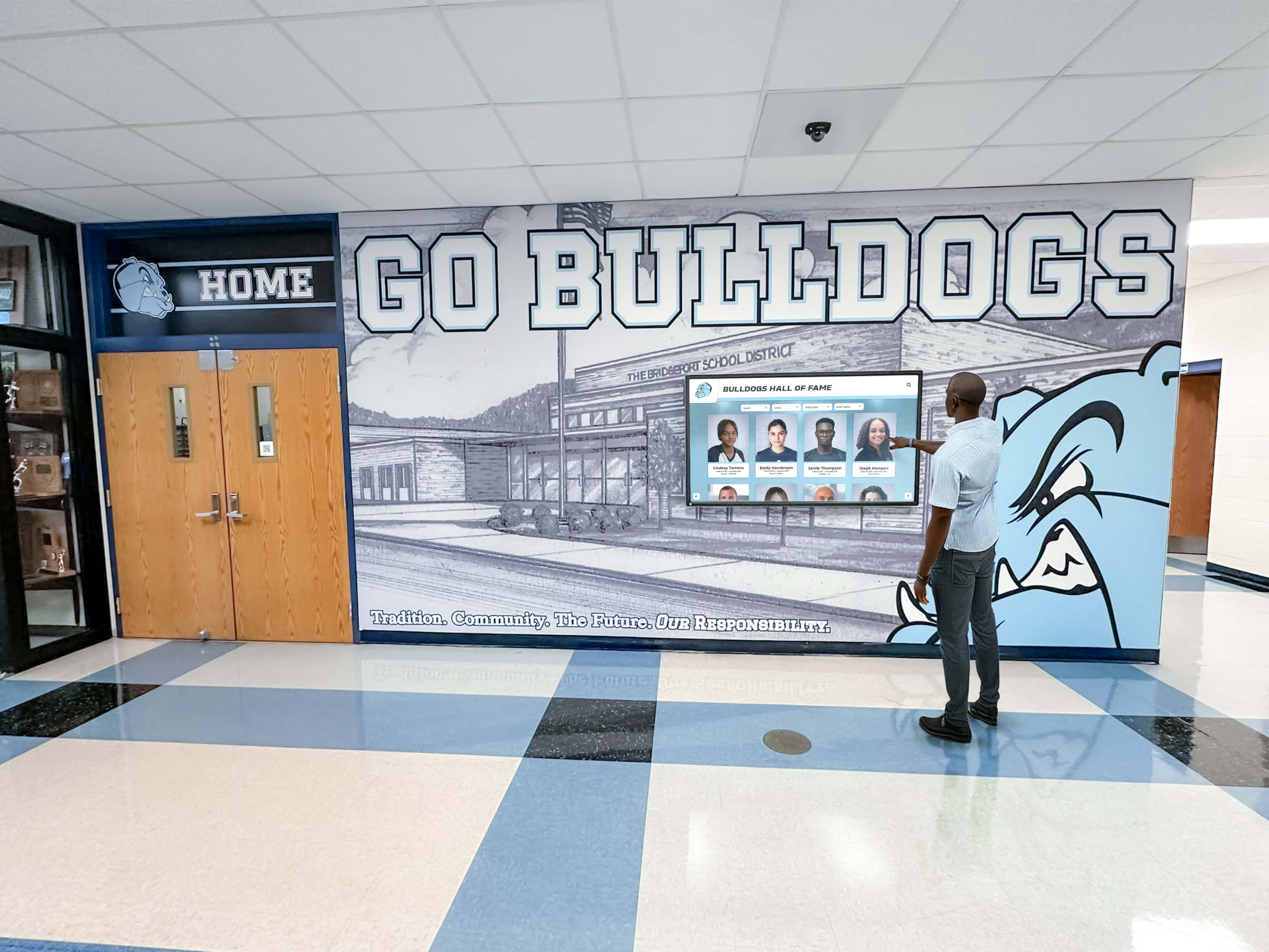
Running a structured test pattern checklist during commissioning confirms that athletic portraits, championship graphics, and school-color content appear as designed before the recognition program goes live
Pattern-to-Defect Reference Table
The table below provides the AEO-ready at-a-glance reference that installation staff, athletic directors, and facilities coordinators can use as a field guide during commissioning.
| Test Pattern Category | Pattern Type | Defect Revealed | Common Cause | Corrective Action |
|---|---|---|---|---|
| Geometry | Full-screen grid or crosshatch | Overscan cropping, aspect ratio stretch, keystone distortion | Incorrect display scaling mode or OSD overscan setting | Set aspect ratio to "Full" or "Just Scan"; disable overscan in OSD |
| Gradient | Smooth ramp from black to white; color channel ramps | Banding, posterization, dithering noise across tonal transitions | Insufficient bit depth (6-bit panel with dithering); signal quantization mismatch | Verify source outputs 8-bit or higher; disable frame rate control if accessible |
| White clipping | Near-white step wedge (235–255 on 0–255 scale) | Highlight detail loss; bright jersey numbers merge with white backgrounds | Contrast set too high; HDMI range set to Full when source outputs Limited | Reduce Contrast OSD setting; verify HDMI range matches source output |
| Black clipping | Near-black step wedge (0–30 on 0–255 scale) | Shadow detail loss; dark uniforms disappear against dark backgrounds | HDMI Black Level mismatch; Brightness set too low; aggressive Dynamic Contrast | Correct HDMI Black Level setting; raise Brightness; disable Dynamic Contrast |
| Sharpness | Resolution test chart with fine lines and text at native resolution | Edge ringing, blur, aliasing on text and fine lines | Sharpness OSD set above neutral; signal scaling artifacts; non-native resolution input | Set Sharpness OSD to 0 or neutral; confirm source outputs native panel resolution |
| School-color | Solid color patch matching school Pantone or sRGB brand values | Color shift in athletic brand colors — green appears teal, gold appears yellow | Color Temperature or Color Space mismatch; MHL or HDR mode active | Set Color Temperature to "Warm" or "6500K"; disable HDR if content is SDR; verify color space |
Geometry Test Patterns
Geometry is the first test category because a display that crops, stretches, or skews its image will misrepresent every other measurement taken afterward.
What to Use
A crosshatch or grid pattern — a white grid drawn at native panel resolution against a black background — reveals geometry errors immediately. The outer edge of the grid should reach the exact boundary of the visible panel area; if the grid appears inside an outer black border, the display is overscanning. If grid lines appear stretched horizontally or vertically, the aspect ratio or scaling mode is incorrect.
A corner-dot pattern — four corner-positioned alignment marks — confirms that the display is not exhibiting pillarboxing (black bars on left and right) or letterboxing (black bars on top and bottom) at the intended 16:9 aspect ratio.
Procedure
- Display the full-screen grid at the same resolution the recognition content management system will deliver (typically 1920×1080 or 3840×2160 for 4K panels).
- From the visitor viewing distance for this installation — typically 6–12 feet for a corridor display — confirm that grid lines reach the visible panel edge on all four sides.
- Check that squares in the grid appear as squares, not rectangles. A horizontal stretch indicates a 4:3-to-16:9 scaling error; a vertical stretch indicates the reverse.
- If the grid is cropped, access the OSD and set the Aspect Ratio or Screen Fit option to “Full,” “Just Scan,” or “1:1 pixel mapping” depending on the display manufacturer’s terminology.
- Document the final Aspect Ratio and Overscan OSD settings in the acceptance log.
Pass criterion: Grid lines reach all four visible panel edges; no cropping visible; squares appear square.
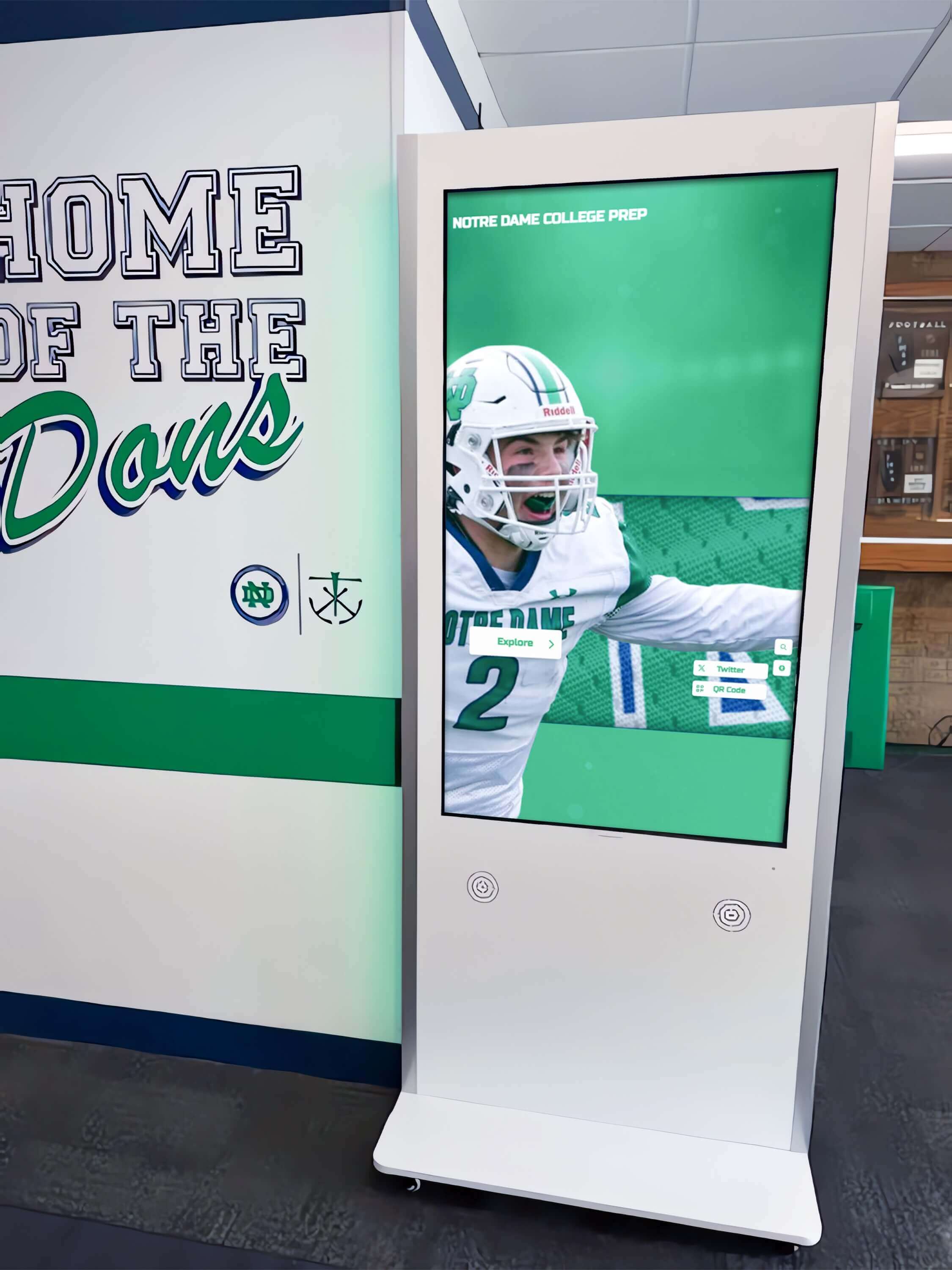
Overscan cropping — one of the most common commissioning oversights — clips athlete names and jersey numbers at the edges of a display without becoming visible until production content is loaded
Gradient Test Patterns
Smooth color transitions appear throughout athletic recognition content: the color gradient on a championship banner, the vignette behind an athlete portrait, the tonal ramp on a school-color background. Gradient artifacts — banding, posterization, or visible steps in a smooth ramp — are a sign of bit-depth limitations or signal encoding issues.
What to Use
A smooth grayscale ramp from pure black (0, 0, 0) to pure white (255, 255, 255) reveals banding. A correctly configured display will show a smooth, continuous gradation with no visible steps. A color channel ramp — a ramp running pure black to saturated red, then green, then blue — reveals whether color banding is limited to a single channel or present across all channels.
Procedure
- Display the grayscale ramp in full-screen mode at the native panel resolution.
- Count visible discrete bands (distinct steps in the gradient). A smooth gradient on an 8-bit display can render 256 distinct steps per channel; visible banding in a smooth ramp indicates quantization compression or panel dithering artifacts.
- Display the red, green, and blue channel ramps individually. Note whether banding is uniform across channels or concentrated in one channel (which would indicate a channel-specific encoding issue).
- If banding is severe, verify that the source device is configured to output 8-bit color depth and that no video compression or limited-bandwidth cable is in the signal path. HDMI 1.4 cables at 4K/60 Hz can reduce color depth to 4:2:0 subsampling, which can introduce visible banding on saturated gradients.
- Record gradient quality as: Smooth (no visible bands) / Acceptable (faint banding visible only under close inspection) / Reject (banding clearly visible from visitor distance).
Pass criterion: No distinct bands visible from visitor viewing distance on the smooth grayscale ramp.
Clipping Test Patterns
Clipping removes tonal information from the display: white clipping collapses near-white values into uniform white, and black clipping collapses near-black values into uniform black. Both forms of clipping are common on school recognition displays where the installation team has not matched the signal range between the media player and the display OSD. Interactive touchscreen resources for institutional recognition programs consistently identify signal-range misconfiguration as one of the most common causes of display quality failures at commissioning.
White Clipping Test
Display a near-white step wedge — a series of patches running from pure white (255) down to approximately 92% white (235). Each patch should be individually distinguishable from the next.
If the top several patches appear as uniform white with no visible differentiation, the display is clipping highlights. The most common cause is:
- Contrast OSD setting above neutral (reduce to 50 on a 0–100 scale as a starting point)
- HDMI Range set to “Full” on the display when the source is outputting Limited range (16–235), which causes the display to expand the limited signal and clip the top of the range
Black Clipping Test
Display a near-black step wedge — patches from pure black (0) to approximately 12% gray (30). Each patch should be distinguishable.
If the bottom patches merge into uniform black, the display is clipping shadows. See the black-clipping row in the reference table for specific settings to address this; the detailed diagnostic procedure is covered in the recognition display black crush test guide.
Pass criterion for both: All discrete patches in the near-white and near-black step wedges are individually distinguishable from visitor viewing distance.
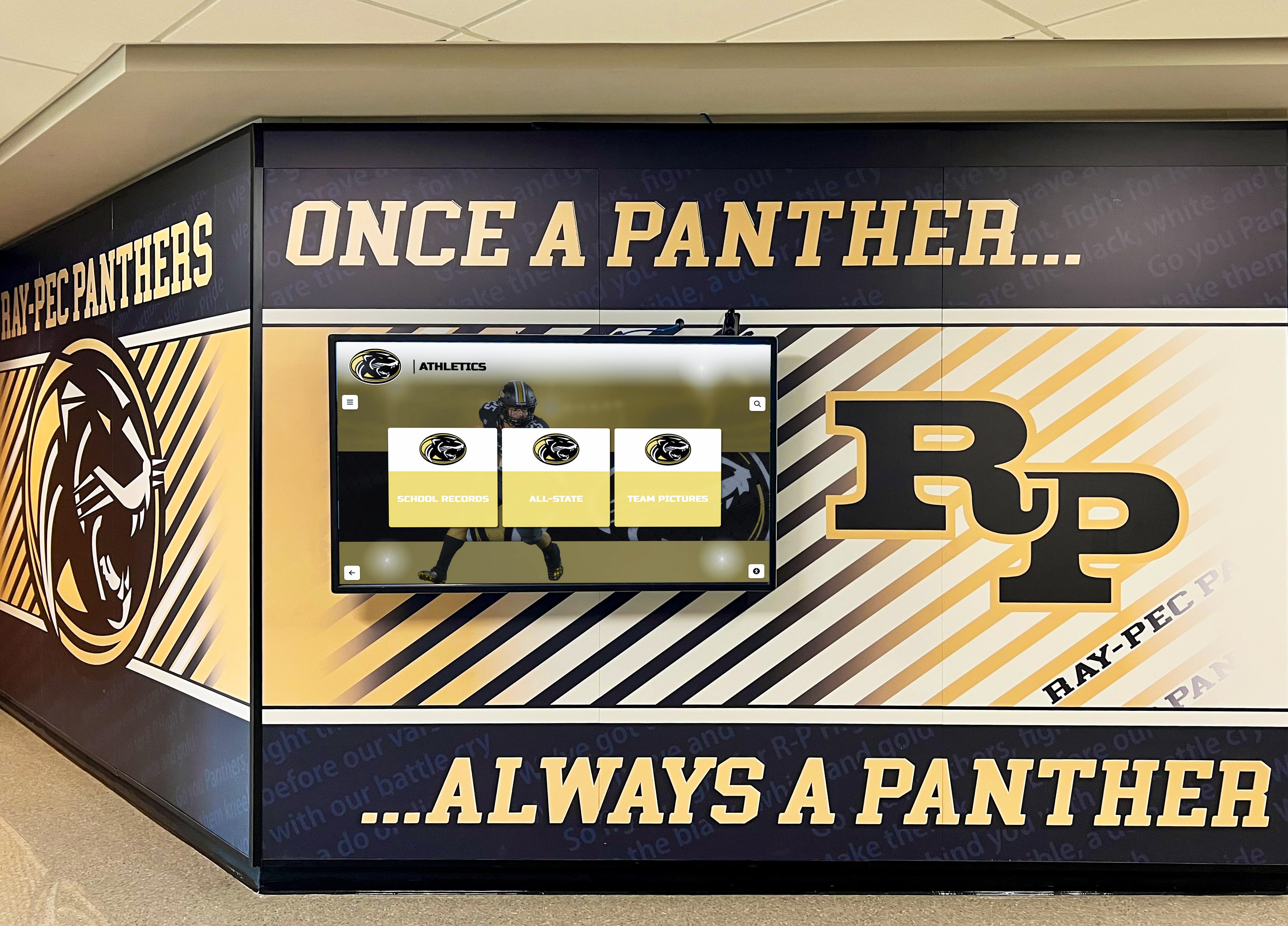
Athletic branding content relies on accurate near-white rendering for jersey numbers and text overlays, and near-black rendering for shadow depth in portrait photography — both ends of the tonal range require separate clipping verification
Sharpness Test Patterns
A sharpness test is critical for recognition displays because the primary content — athlete names, statistics, graduation years, jersey numbers — is typographic. A display that applies artificial sharpening (edge enhancement) adds ringing artifacts that make fine text appear embossed or outlined, which reduces legibility rather than improving it. A display receiving a scaled signal produces aliasing artifacts on fine diagonal lines in logos and mascot graphics.
What to Use
A resolution test chart — a pattern showing progressively finer line pairs in both horizontal and vertical orientations, accompanied by a block of small text at various point sizes — reveals both sharpness and resolution limits.
Procedure
- Display the resolution test chart at native panel resolution (1:1 pixel mapping must be confirmed in the geometry step before this test is meaningful).
- From visitor viewing distance, confirm that the finest line pairs in the chart are still distinguishable. Lines that merge indicate either that the display is not receiving a native-resolution signal or that its optical system does not support the advertised resolution.
- Read the small text block at the bottom of the chart from visitor distance. For a corridor recognition display, text at 12pt equivalent in the test chart should be legible from 8 feet.
- Check for edge ringing — a dark or bright halo on the edges of fine lines. If ringing is visible, access the OSD Sharpness setting and reduce it toward 0 or neutral. Many commercial displays ship with Sharpness set to 30–50 on a 0–100 scale, which produces visible ringing on fine text content.
- Verify that the source device is delivering the display’s native resolution. A 4K display receiving a 1080p signal must upscale, and upscaling quality varies significantly between display models.
Pass criterion: Fine line pairs distinguishable; small-text block legible from specified viewing distance; no ringing visible on sharp text edges.
Museum and gallery touchscreen installations — which share similar display sharpness requirements with school recognition programs — treat text legibility verification as a non-negotiable acceptance step, since typographic content is the primary vehicle for communicating names, dates, and achievements to visitors.
School-Color Reproduction Verification
School athletic programs use specific brand colors — defined in Pantone, CMYK, or sRGB values — to represent the institution on championships graphics, record boards, and hall-of-fame displays. A display that renders navy blue as purple, or gold as yellow, misrepresents the school’s visual identity in the space where athletic legacy is preserved.
What to Use
A solid color patch matching each school brand color’s sRGB value, displayed full-screen and compared with a reference source — a printed Pantone swatch, a calibrated laptop screen, or a color chip from the institution’s brand guidelines.
For common athletic brand colors, the approximate sRGB values to verify:
| Color Name | Approximate sRGB | Common Display Failure | OSD Fix |
|---|---|---|---|
| Athletic navy | (0, 27, 100) or similar deep blue | Rendered too purple or too cyan | Reduce Blue gain; set Color Temperature to Warm/6500K |
| Athletic gold / maize | (255, 184, 28) or similar | Rendered too yellow or too orange | Reduce Red gain slightly; verify no "Vivid" picture mode active |
| Forest green | (0, 89, 65) or similar deep green | Rendered teal or lime | Adjust Green gain; verify sRGB color space is active on source |
| Cardinal / deep red | (140, 0, 3) or similar | Rendered as brighter, lighter red | Reduce Contrast; set Color Temperature to Neutral |
| Purple | (79, 38, 131) or similar | Rendered too blue or too magenta | Balance Red and Blue gain; disable any "Color Enhancement" feature |
Procedure
- Obtain the sRGB values for each school brand color from the institution’s brand guidelines or communications office.
- Create solid-color patch images using those exact sRGB values, or use a color-patch generator application that outputs full-screen patches.
- Display each patch on the recognition display and compare with the reference source.
- If the school’s navy appears purple, access the White Balance or Color Temperature OSD and move toward the Warm end of the scale. If gold appears too saturated or orange, verify the picture mode is not in a “Vivid” or “Dynamic” preset, which typically boosts color saturation beyond accurate rendering.
- Document the final Color Temperature setting, any per-channel gain adjustments, and the picture mode selected for school-color content.
Digital yearbook and school recognition touchscreen programs place particular emphasis on brand-color accuracy because recognition displays in athletic hallways and trophy corridors are often viewed by alumni who associate specific color shades with their team identity — a display that renders the wrong shade of navy or gold will be noticed immediately by people who spent four years wearing those colors.
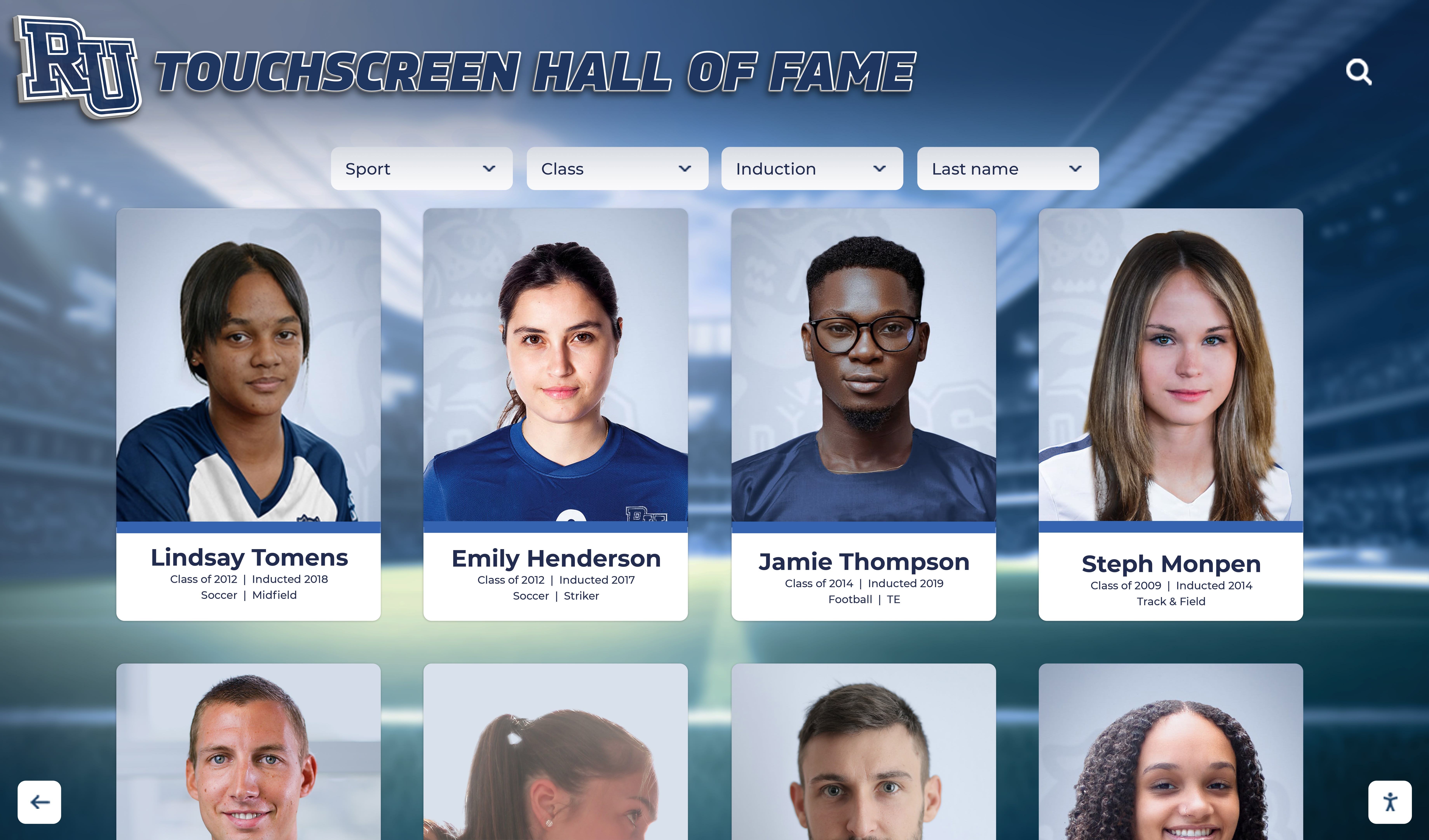
Athlete portrait cards that use school brand colors as graphic elements depend on accurate color reproduction — a hue shift in navy, gold, or cardinal red is immediately visible to alumni and community members who know the institution's colors
Running the Checklist Before Go-Live
The five test pattern categories should be run in sequence at each installation, with results recorded in a structured acceptance log. The order matters: geometry must be confirmed before sharpness testing is meaningful (since a cropped or scaled image distorts sharpness measurements), and black level must be set before school-color accuracy can be assessed (since tonal brightness affects perceived hue).
Recommended Commissioning Sequence
- Warm-up: Power the display and allow 15 minutes for thermal stabilization before beginning testing. Backlight output and color rendering stabilize after the first several minutes of operation, and measurements taken before stabilization may not reflect steady-state performance.
- Geometry: Run crosshatch and corner-dot patterns; confirm full-screen rendering and correct aspect ratio.
- Clipping: Run near-black step wedge; correct HDMI range and Brightness if needed. Run near-white step wedge; correct Contrast if needed.
- Gradient: Run grayscale and color ramps; confirm smooth gradation without visible banding.
- Sharpness: Run resolution test chart; set OSD Sharpness to neutral; confirm text legibility.
- School-color: Run brand-color patches; compare with reference; adjust Color Temperature and per-channel gain if needed.
- Final verification: Re-run all six steps to confirm that adjustments made in any one step have not degraded results in a previous step (Color Temperature changes can affect black level; Contrast changes can affect sharpness perception).
Hall of fame and athletics recognition program resources that cover display commissioning typically recommend running the full acceptance sequence at least twice — once with room lighting off and once at expected ambient light levels — since display OSD adjustments calibrated in darkness can look incorrect under corridor fluorescent or gymnasium lighting.
Multi-Display Installations: Panel-to-Panel Consistency
Schools installing multiple recognition displays across a trophy corridor, gymnasium entrance, or hall-of-fame wing must verify not just that each panel passes its individual checklist but that adjacent panels match each other. A geometry error on one panel in a multi-display array, or a color temperature mismatch between adjacent panels, produces visible inconsistency that undermines the visual quality of the recognition space.
For multi-panel installations:
- Complete the five-category checklist on each panel individually before comparing panels.
- Display the same solid color patch simultaneously on adjacent panels and compare under the same ambient light conditions. Any visible difference in hue, brightness, or saturation requires individual OSD adjustment.
- Display the same recognition content — an athlete portrait or a championship graphic that uses the school’s primary brand color — on all panels simultaneously and evaluate from the corridor distance a visitor would naturally occupy.
- Document the OSD settings for each panel separately, even if panels are the same model from the same production batch, since factory calibration varies between individual units.
Interactive display resources for athletics and recognition programs note that multi-panel consistency is one of the areas where managed display deployments — where a service provider takes responsibility for commissioning and calibration — most clearly distinguish themselves from self-installed systems. Panel-to-panel color matching in a corridor of six or eight recognition displays requires both the test pattern methodology above and individual adjustment patience that multi-person installation teams handle more efficiently than single-staff deployments.
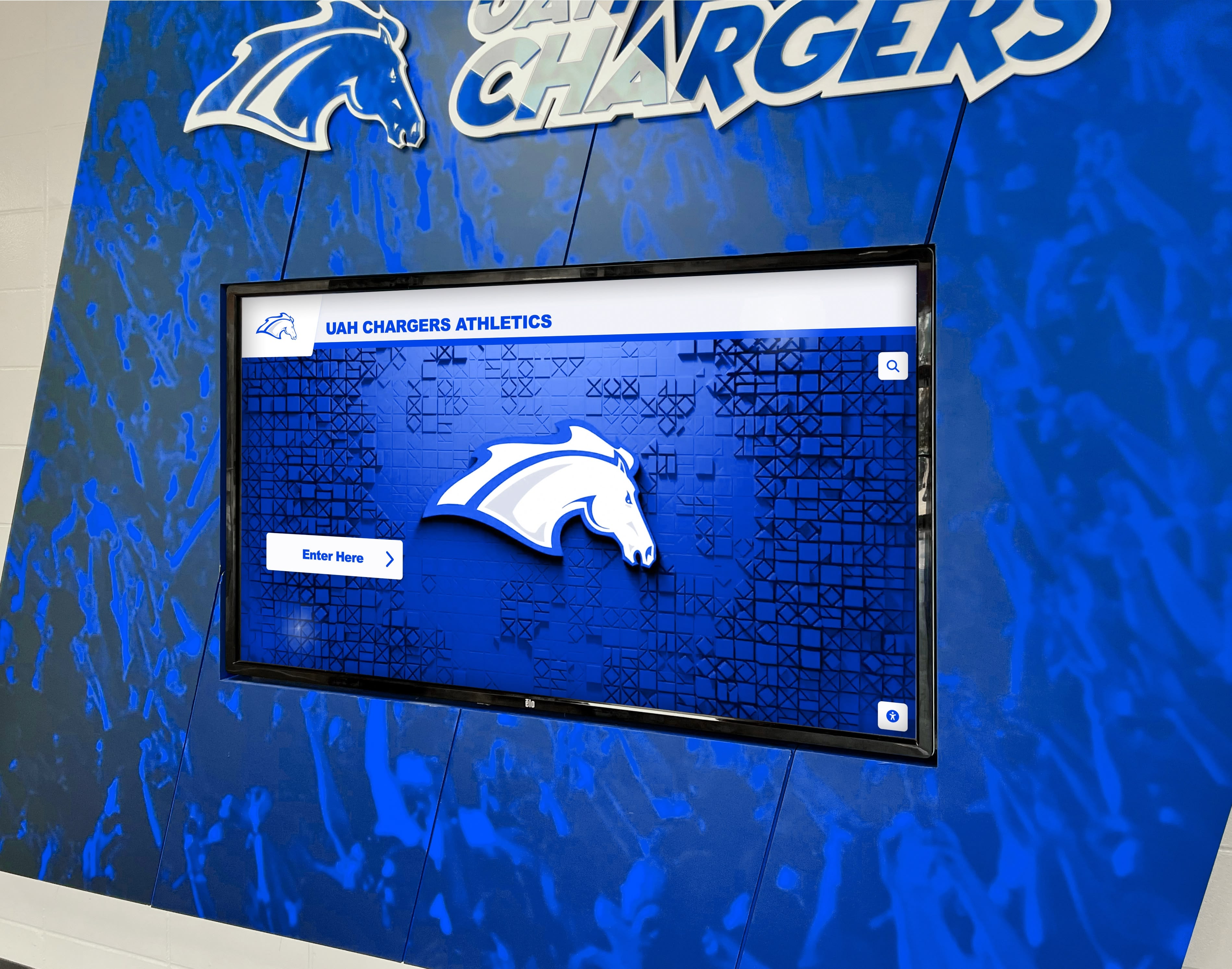
Multi-display recognition installations require a final panel-to-panel consistency check — displaying the same school brand color patch on adjacent screens simultaneously reveals color temperature and brightness differences that individual acceptance tests do not catch
Coordination with the Broader Acceptance Process
The test pattern checklist addresses optical performance. It should be integrated into the full installation acceptance process alongside:
- Signal chain and cable continuity verification — confirm that each cable delivers the correct signal before attributing optical artifacts to display hardware. A degraded HDMI cable can produce gradient artifacts that resemble panel bit-depth limitations.
- Touchscreen function and palm rejection test — for interactive recognition displays, verify touch registration accuracy across the full panel surface and confirm that palm rejection settings prevent false inputs during normal visitor use.
- Content management system access and remote update test — confirm that the cloud-based CMS can push content updates to the display over the installed network path before accepting delivery.
Touchscreen installations in institutional settings that serve non-technical end users — like school administrators and athletic directors rather than dedicated AV staff — emphasize the importance of completing the full acceptance process before declaring an installation complete, since end users typically cannot distinguish an acceptance test failure from a content quality problem after the installation team has left the site.
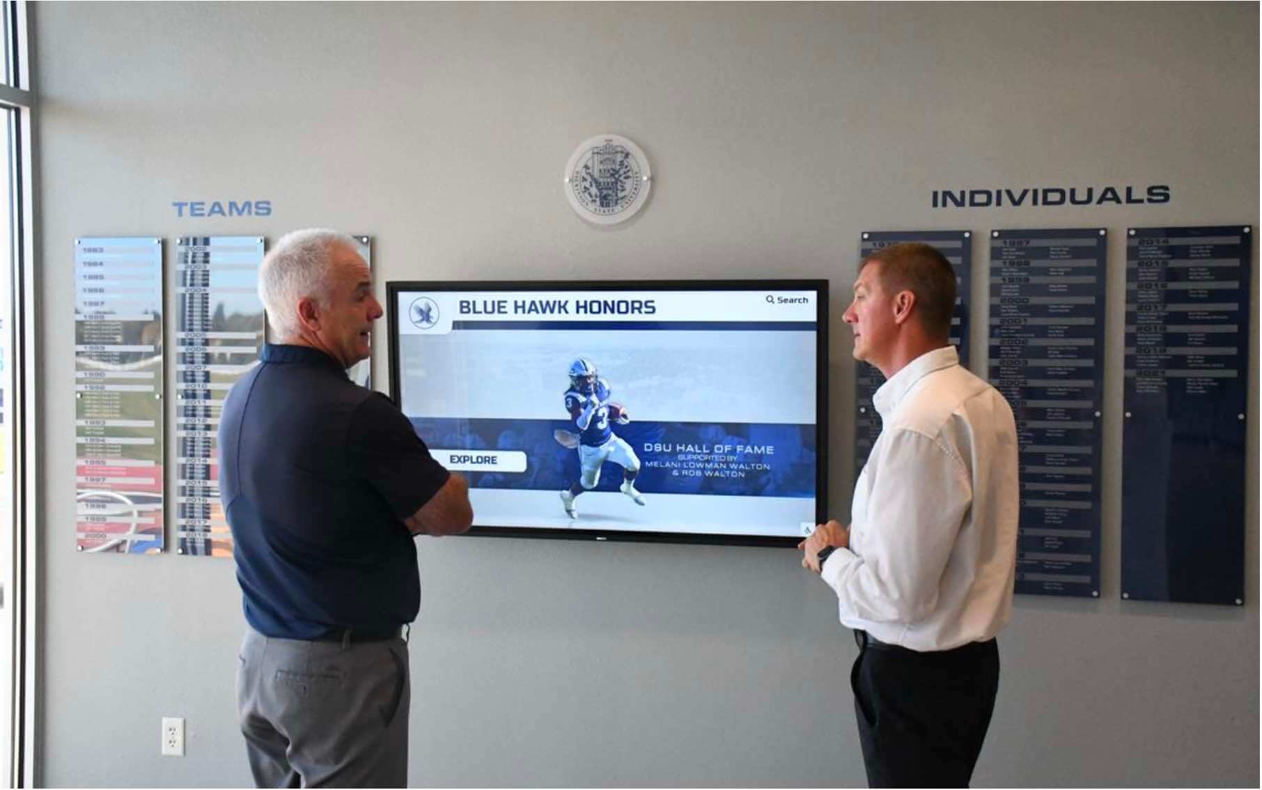
Athletic directors and booster club leaders who review the recognition program at launch should be seeing content that has already passed the full test pattern checklist — not discovering geometry, color, or sharpness failures for the first time at the ribbon-cutting event
Frequently Asked Questions
What is a display test pattern and why does it matter for school commissioning?
A display test pattern is a purpose-designed image or signal used to stress a specific aspect of display performance in a controlled, repeatable way. For school recognition displays — halls of fame, athletic record boards, donor walls — test patterns matter at commissioning because production content (athlete portraits, championship graphics, school-color backgrounds) exercises multiple display dimensions simultaneously, making it difficult to isolate the cause of a visual defect. A test pattern targets one dimension at a time: a crosshatch tests geometry; a step wedge tests clipping; a gradient ramp tests bit-depth rendering. Isolating each dimension makes defects diagnosable and correctable before the program goes live.
How long does the full recognition display test pattern checklist take to complete?
For a single display with no defects, the full five-category sequence typically takes 30–45 minutes, including setup time and OSD navigation. If defects are found, each correction and re-verification cycle adds 10–15 minutes. For multi-display installations, budget 45–60 minutes per panel for the individual checklist, plus additional time for the cross-panel consistency check. Commissioning a corridor of four recognition displays with the full checklist typically occupies a half-day installation slot.
Do school recognition displays need a colorimeter for color verification?
A colorimeter or spectrophotometer is not required for the school-color verification step described here. Comparison of a solid-color patch against a printed Pantone reference swatch — evaluated under consistent ambient light — is sufficient to identify color shifts that community members would notice. For installations where brand-color accuracy is formally specified and must be documented to a Delta-E tolerance, a colorimeter is appropriate. For the majority of school recognition display installations, the visual reference comparison against brand-color swatch materials provides a practical and reliable acceptance criterion.
What if a display fails the test pattern checklist and OSD corrections do not resolve the issue?
Document the failure precisely: which test pattern category, which specific defect, which OSD settings were adjusted, and the result after each adjustment. Contact the display vendor with the documented failure before signing acceptance paperwork. Hardware defects — a panel that cannot be adjusted to pass the geometry test, or a panel with visible gradient banding that does not improve with signal-chain changes — are vendor responsibility issues that should be resolved before acceptance. A display vendor who requires you to accept delivery on a promise that a future firmware update will correct a test pattern failure should be asked to provide that correction before the acceptance signature.
Should the test pattern checklist be re-run after the recognition content management system goes live?
Re-run the clipping and school-color sections of the checklist if the content management system (CMS) undergoes a major update that changes how video or graphics are encoded and delivered to the display. CMS updates that alter the media player’s color space output, bit depth, or HDMI signal range can produce clipping or color shift on a display that previously passed acceptance. Geometry and sharpness settings are OSD configurations stored in the display and are not typically affected by CMS software updates unless the display is factory reset.
A recognition display test pattern checklist is a structured, repeatable procedure that any school IT coordinator, facilities manager, or AV installation team member can execute with free or low-cost test pattern resources. Running geometry, gradient, clipping, sharpness, and school-color patterns in sequence — and documenting the results — transforms acceptance from an informal visual impression into a verifiable record that the display meets the visual quality standard the recognition program requires.
Looking for a recognition display partner that handles hardware commissioning alongside content deployment? Rocket Alumni Solutions installs interactive hall-of-fame, athletic record board, and donor wall systems in schools nationwide, with structured processes that include display acceptance testing as part of every deployment. Request a demo to learn how their managed approach covers the technical details so your team can focus on building a recognition program your community will be proud of.