Intent: demonstrate — this guide walks school IT coordinators, AV teams, and facilities staff through a recognition display color gamut test so every element shown on a touchscreen hall of fame, athletic record board, or donor wall — team logos, uniform reference images, award graphics, and archival photography — reproduces school colors with consistency before the display is accepted for installation.
A color gamut test confirms that the display’s panel can produce the full range of colors present in the school’s recognition content and that the display’s color mode, cable chain, and content management system (CMS) are configured to deliver those colors accurately. A panel that passes a brightness check and a motion test can still fail on color: a school whose official colors are a saturated navy and a specific metallic gold may receive a display configured in a color mode that shifts the navy toward teal or compresses the gold toward yellow. Running a structured color check before the installer leaves — and before acceptance paperwork is signed — catches these problems while corrective action is still straightforward.
The quick answer: display reference swatches of the school’s official team colors at full screen, compare the rendered output against a known-good reference (a calibrated monitor, a printed Pantone chip, or a recently printed uniform graphic), and document the result before acceptance. A mismatch visible to the naked eye from the standard visitor viewing distance warrants investigation before the display goes live.
This procedure is hardware-neutral and applies to 55-inch lobby kiosks through 86-inch athletic hallway installations driven by any combination of embedded media players, external PCs, or cloud-based content management platforms.
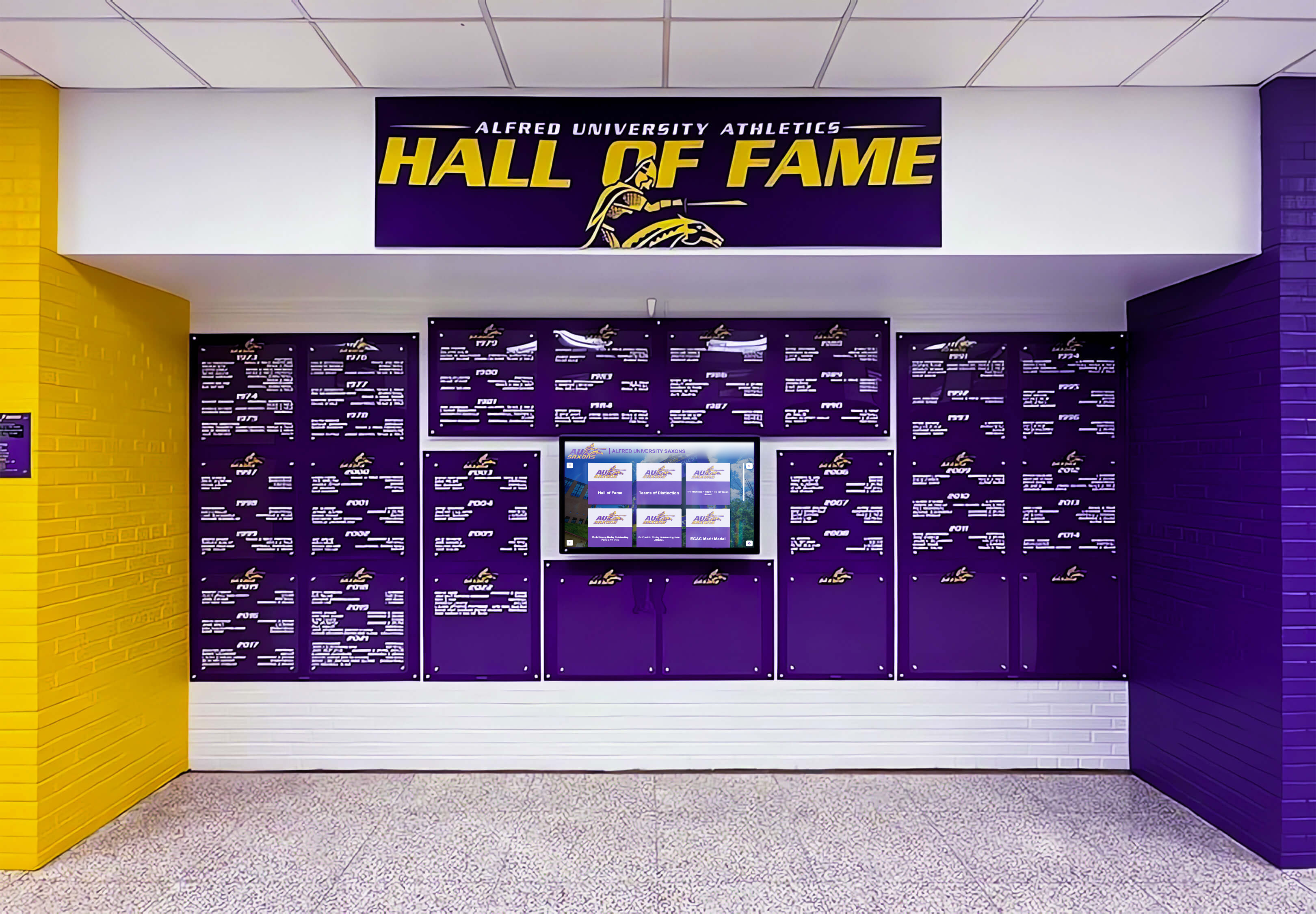
School colors carry institutional identity — a color gamut test confirms that the display reproduces those colors accurately before the recognition program goes live to families, donors, and visitors
Why Color Gamut Matters for Recognition Displays
Static institutional content — logos, uniform photographs, award graphics, sponsor banners — is far more color-sensitive than general-purpose digital signage. Three characteristics of school recognition programs make color gamut testing especially important.
Team colors are identity markers. A school’s official navy, crimson, or forest green is not an arbitrary choice. It appears on uniforms, championship banners, trophy plaques, printed donor acknowledgments, and years of archival photography. When a recognition display shifts that color — rendering the navy as a medium blue, or the forest green as a yellow-green — every image and graphic on the display signals a mismatch that families and alumni will notice immediately. Dance team logo design and identity graphics represent the same principle: a color rendered incorrectly on a digital display undermines the identity the graphic is meant to carry.
Archival photographs span decades. School halls of fame and athletic archives regularly include photographs from the 1970s, 1980s, and 1990s scanned from printed originals. These images have their own color characteristics — film-based color casts, faded pigments, varied scanning conditions — that interact differently with display color modes than modern digital photography. A display configured in a mode optimized for commercial signage may apply color enhancement algorithms that shift these archival tones in unpredictable ways.
Sponsor and donor graphics carry external brand requirements. Many school recognition programs include sponsor logos, donor acknowledgment graphics, and booster club artwork whose colors are specified by an external brand standard. A sponsor whose brand requires a specific shade of red will notice if the recognition display renders that red as orange or magenta. Meaningful celebration and recognition content for awards programs depends on accurate color reproduction to convey the respect the program intends.
Color Gamut Fundamentals for School IT Teams
A display’s color gamut is the range of colors the panel can produce. Most commercial recognition displays specify their color gamut as a percentage of a standard color space — most commonly sRGB, which was defined for web and general-purpose digital content, or DCI-P3, a wider standard used in cinema and professional displays. A display that covers 100% of sRGB can produce every color in the sRGB standard. A display that covers only 72% of sRGB cannot produce the most saturated colors in that standard — highly saturated team colors may appear visibly muted on such a panel.
Understanding three terms makes the test procedure easier to interpret:
Color space: The mathematical definition of which colors exist within a range. sRGB and DCI-P3 are the most common for display evaluation. School recognition content produced by a CMS or graphic designer is typically specified in sRGB.
Color gamut coverage: The percentage of a given color space that the display can reproduce. A display covering 100% sRGB can show all standard digital colors accurately. A display covering 72% sRGB — a common specification for lower-cost commercial panels — will show highly saturated colors (including many team colors) as noticeably muted.
Color mode: The setting in the display’s OSD (on-screen display) menu that determines how the panel interprets and renders the incoming signal. Common modes include Standard, Vivid, Movie, AdobeRGB, and sRGB. Each mode applies different color processing — a Vivid mode typically boosts saturation beyond the source signal, which can shift a specific brand color away from its intended value even on a wide-gamut panel.
The goal of a color gamut test is not to measure gamut coverage with laboratory instruments — that requires a colorimeter or spectrophotometer. The goal is to verify, visually and with a structured comparison, that the display configured for its production environment renders school colors with acceptable accuracy.
Tools Required
| Item | Purpose | Notes |
|---|---|---|
| Reference color swatches (digital) | Full-screen test targets for each team color | Create as solid-color PNG or JPEG files at 1920×1080 or the display’s native resolution; use exact hex or RGB values from the school’s brand guide |
| Reference color swatches (physical) | Visual comparison standard | A recent uniform garment, a printed banner, a Pantone chip, or a printed brand guide page — any known-good physical color reference |
| Display OSD access | Confirm color mode and color temperature settings | Access via display menu button or remote; navigate to Picture or Color settings |
| Calibrated secondary monitor (if available) | Side-by-side comparison for critical colors | Use a laptop or desktop monitor recently calibrated or factory-reset to sRGB; not required but useful for borderline results |
| Media player or source device (production unit) | Drive the test content | Must be the actual installed production device — do not substitute a test laptop |
| Observation log | Document pass/fail and observations for each color | Template provided in Step 5 below |
Preparing School Color Reference Files
Before testing, prepare a set of digital reference files using the school’s official color values. If the school has a brand guide, use the RGB or hex values specified there. If no brand guide exists, request the values from the athletic department or communications office — if neither source has them, extract them from a high-quality version of the school logo using an image color picker, noting that this introduces some uncertainty.
File format guidance: Create each reference file as a solid-color PNG at the display’s native resolution (typically 1920×1080 or 3840×2160). JPEG compression introduces color artifacts in solid-color areas that can confuse visual comparison. Name files clearly: navy-blue-reference.png, gold-reference.png, and so on.
Minimum color set for school recognition displays:
- Primary team color (typically the dominant uniform color)
- Secondary team color (the contrasting accent color)
- White (255, 255, 255 RGB) — used for text backgrounds and award card fields
- Black or near-black (0, 0, 0 or 15, 15, 15 RGB) — used for text and background areas
- Any sponsor or donor brand colors included in the recognition program
- A photographic image with skin tones — a headshot of an athlete or faculty member — to verify neutral color rendering
Pre-Test Display Configuration
Configuring the display correctly before running color tests prevents the most common sources of incorrect results. Incorrect OSD settings account for the majority of color discrepancies observed during recognition display installations.
Step 1: Set the display to sRGB or Standard color mode.
Open the display OSD and navigate to Picture or Color settings. Select the sRGB mode if available; if not, select Standard mode. Avoid Vivid, Dynamic, or Presentation modes for this test — these modes apply saturation enhancement that will make the test pass criteria misleading. The display will run in the mode used during this test for its production life, so select the mode your school intends to use permanently.
Step 2: Set color temperature to 6500K (D65).
School recognition content — especially logos and archival photographs — is typically produced for a D65 (6500 Kelvin) white point, which is the standard for sRGB content. A display set to a warmer color temperature (5500K) will shift whites toward yellow-orange; a cooler setting (9300K) will shift whites toward blue. Both shifts affect how team colors and skin tones appear. Set the display to 6500K or the closest available preset (labeled “Warm,” “Normal,” or “6500K” depending on the manufacturer).
Step 3: Disable color enhancement, dynamic contrast, and HDR if present.
Features such as Intelligent Color, Local Dimming, Dynamic Contrast, and automatic HDR switching can significantly alter color rendering on a frame-by-frame basis, making consistent color comparison impossible. Disable all such features before running the test. If the display will use any of these features in production, conduct a second test pass with the intended production settings after the baseline test is complete.
Step 4: Allow the display to warm up for at least 15 minutes.
Display color characteristics — particularly color temperature and black level — shift during the first 10 to 20 minutes of operation as the panel and backlight reach thermal equilibrium. Run the display with a neutral gray test pattern for 15 minutes before beginning color comparison steps.

Color accuracy matters most in installations where the display appears alongside physical branding elements — a color shift visible against school tiles or painted walls signals a misconfiguration worth correcting before go-live
Recognition Display Color Gamut Test Procedure
Step 1: White Point and Neutral Tone Check
Display the white reference file (255, 255, 255) at full screen. Observe from standard visitor viewing distance (6 to 10 feet for a hallway kiosk; 10 to 15 feet for a lobby display).
White should appear neutral — neither yellow-warm nor blue-cool. Compare the white against a printed page or a sheet of white paper held near the display. A strongly colored white indicates the color temperature setting is incorrect for the content type. A slight warm or cool shift is acceptable if it is consistent with the school’s aesthetic preference; document the observed shift and the chosen color temperature setting.
Next, display the near-black reference (0, 0, 0). Black areas should appear as dark as the panel allows without visible color cast (a dark green or dark blue shift in black areas indicates the RGB balance is uncalibrated). Record pass or fail.
Pass criteria: White appears neutral or within acceptable warmth preference; black areas show no visible color cast.
Step 2: Primary and Secondary Team Color Verification
Display the primary team color reference file at full screen. With the physical reference (uniform, printed banner, or Pantone chip) in hand, stand at the standard visitor viewing distance and compare the displayed color to the physical reference.
Evaluate three characteristics:
- Hue accuracy: Does the displayed color belong to the same color family as the reference? A navy should look navy, not teal or medium blue. A forest green should look green, not yellow-green or teal.
- Saturation: Does the displayed color appear as vivid as the physical reference, or does it appear washed out and muted? A school whose brand requires a saturated crimson should not receive a display that renders crimson as pink or dusty rose.
- Lightness: Is the displayed color similar in brightness to the reference, or noticeably lighter or darker? A metallic gold should not appear as a pale lemon yellow or a deep olive.
Repeat the procedure for the secondary team color.
Pass criteria: Each team color matches the physical reference in hue, saturation, and lightness to a degree that a school administrator unfamiliar with display calibration would not notice a discrepancy from visitor viewing distance.
Step 3: Archival Photography and Skin Tone Check
Display the headshot photograph reference file. Evaluate:
- Skin tones: Do skin tones appear natural and neutral, or do they show a green, yellow, or magenta cast? A strongly colored skin tone indicates the display’s white balance or color matrix is misconfigured.
- Archival color cast: If the photograph is a scanned archival image (warm amber tones typical of 1970s–1980s photography, or desaturated tones typical of early color printing), does the display render it as a recognizable historical image, or does color enhancement processing significantly alter its character?
Digital hall of fame profile content across decades of athletic history includes photographs from many eras — a display configured to aggressively enhance color will treat archival photography differently than it treats modern digital photos, creating an inconsistent visual experience across the recognition program.
Pass criteria: Skin tones appear natural and neutral from visitor distance; archival photographs are not visibly altered by display processing beyond what the source image contains.
Step 4: Logo and Graphic Brand Color Check
Display a full-screen version of the school logo graphic — or a representative composite showing several logos and award graphics — and compare to a printed version of the same graphic or a second monitor showing the same file.
Pay particular attention to:
- Logo colors versus reference: The logo’s primary and secondary colors should match the same team color references evaluated in Step 2. If the logo was produced with slightly different color values than the brand guide (a common discrepancy between print and digital production), document both the logo values and the brand guide values so the school’s content team can address the source file if needed.
- Gradient and shadow areas: Many school logos include graduated shadows or metallic effects. These areas reveal color rendering problems that solid swatches may not — a compressed gamut shows as banding in gradients, while incorrect color matrix settings often appear as unexpected hue shifts in shadow regions.
- Sponsor logos: If sponsor and booster logos are included in the recognition display, verify each sponsor’s primary brand color against any printed reference the school has received from that organization. Schools that include medal and award graphic displays alongside digital recognition content understand that external brand accuracy matters as much to sponsors as it does to the school’s own identity.
Pass criteria: Logo colors match the printed reference and the team color swatches from Step 2 with no visible discrepancy from visitor distance; no banding visible in gradient areas.
Step 5: Record Results and Make a Go / No-Go Decision
Document every test observation before acceptance. This record serves as the baseline for future color complaints and as evidence in warranty discussions if problems emerge after installation.
| Test | Reference Color / Content | Color Mode (OSD) | Color Temp (OSD) | Result | Observed Issue | Tested By | Date | Action |
|---|---|---|---|---|---|---|---|---|
| White Point | 255, 255, 255 | sRGB / Standard | 6500K | Pass | None | Cleared | ||
| Black Level | 0, 0, 0 | sRGB / Standard | 6500K | Pass | None | Cleared | ||
| Primary Team Color | [Hex value] | sRGB / Standard | 6500K | Fail | Hue shifts toward teal | Investigate color matrix settings | ||
| Secondary Team Color | [Hex value] | sRGB / Standard | 6500K | Pass | None | Cleared | ||
| Archival Photo / Skin Tone | Headshot photograph | sRGB / Standard | 6500K | Pass | None | Cleared | ||
| School Logo Graphic | Official logo file | sRGB / Standard | 6500K | Pass | None | Cleared | ||
| Sponsor Logo(s) | Sponsor brand file | sRGB / Standard | 6500K | Pass | None | Cleared |
Go / No-Go rule: A display passes when all color tests show accurate hue, saturation, and lightness matching the physical references from visitor viewing distance, with no visible discrepancy that an untrained observer would notice. Any hue failure on a team color or logo must be investigated and resolved before acceptance. A single lightness or saturation discrepancy that falls within the acceptable range for the school’s ambient lighting conditions may be documented and conditionally accepted if the school’s administrator is present and agrees in writing.
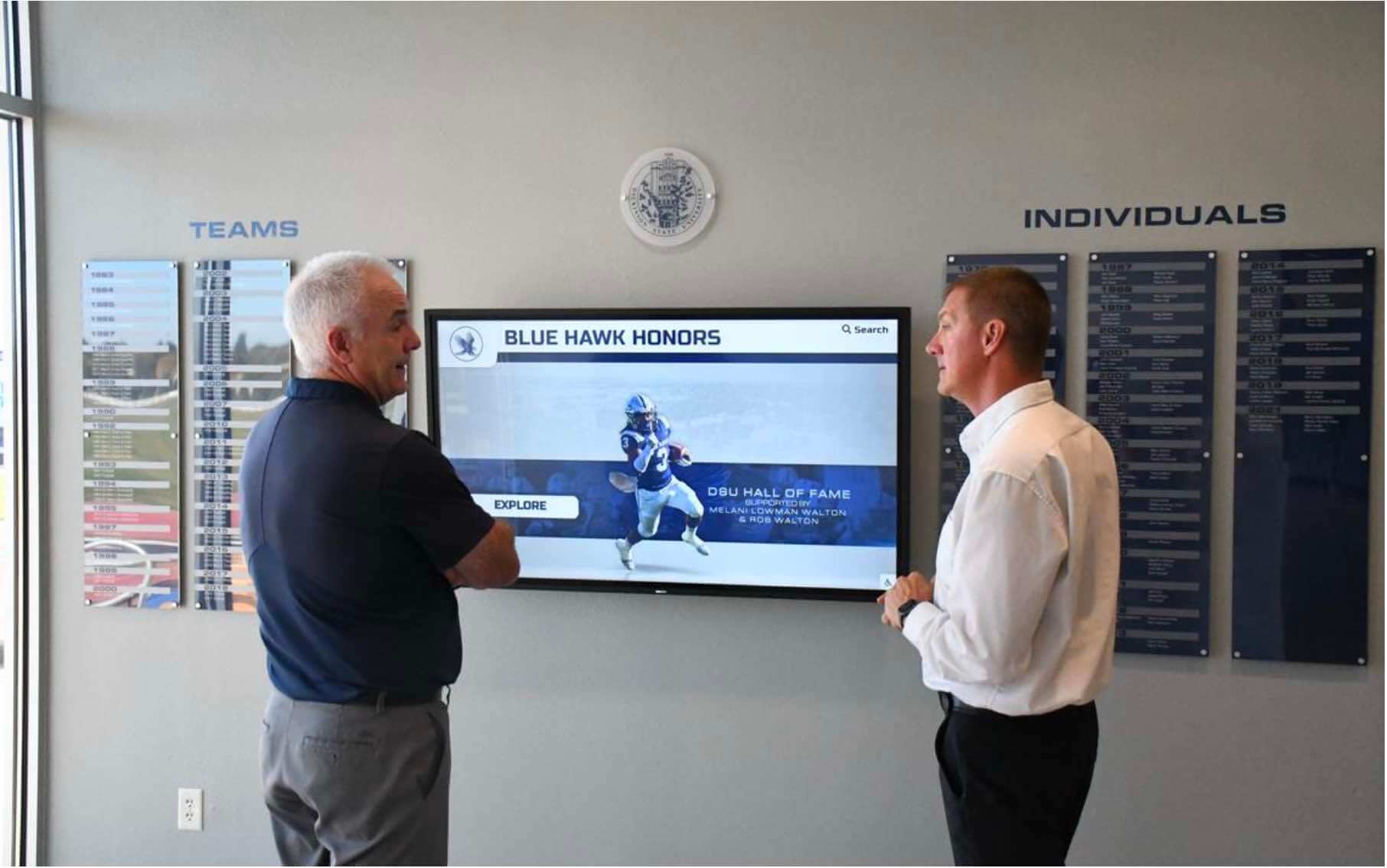
Color acceptance tests benefit from two reviewers — one managing content playback, one observing from visitor distance with physical reference materials in hand
Color Problem Diagnosis Table
When a test step fails, use this table to identify the most likely cause before escalating to the vendor.
| Observed Problem | Most Likely Cause | First Corrective Action | Escalate If |
|---|---|---|---|
| Team color shifts toward a neighboring hue (navy → teal; crimson → orange) | Display color mode set to Vivid or Dynamic, which boosts green or red channels beyond the source signal | Switch OSD color mode to Standard or sRGB; re-run team color test | Hue shift persists in Standard/sRGB mode — may indicate panel color matrix miscalibration |
| All colors appear muted or washed out | Display gamut coverage is insufficient for the content (commonly 72% sRGB panels showing highly saturated team colors) | Confirm panel specification — check manufacturer's gamut coverage spec; if below 90% sRGB for saturated content, discuss with vendor | Muted colors persist on a display specified at 100% sRGB — verify panel specification with vendor documentation |
| White appears yellow-warm or blue-cool | Color temperature setting is not 6500K | Adjust OSD color temperature to 6500K (or "Normal"/"Warm" nearest equivalent); re-run white point check | White appears colored even at 6500K setting — may indicate backlight color uniformity issue |
| Skin tones show green or magenta cast | RGB gain or bias settings are misaligned (one color channel is stronger than the others) | Reset display to factory defaults and re-test; factory defaults are usually closer to calibrated than manual adjustments made by the installer | Cast persists after factory reset in Standard/sRGB mode — escalate to vendor as a panel calibration issue |
| Logo gradient areas show banding | Display bit depth is insufficient (8-bit panel with dithering), or HDMI signal is configured for limited color range (16–235) instead of full range (0–255) | Check source device display output settings — ensure output is set to "Full" color range (0–255), not "Limited" (16–235); "Limited" range clips shadow and highlight detail and shifts midtones | Banding persists with full-range signal confirmed — discuss panel bit depth with vendor |
| Colors look correct on media player desktop but wrong when CMS content plays | CMS software or media player is applying its own color profile or rendering in a different color space than the source files | Check CMS settings for color space or profile management options; confirm that source image files are tagged as sRGB; some CMS platforms strip or ignore embedded color profiles | Discrepancy persists after confirming sRGB source and checking CMS settings — escalate to CMS vendor's technical support |
Ambient Lighting and Viewing Conditions
Color accuracy testing must replicate the actual viewing conditions the display will experience in operation. Lighting conditions have a significant effect on perceived color: a display that passes a color test in a darkened room may appear substantially different when the hallway lighting is at full intensity.
Conduct the color test with the room’s normal lighting active. If the display is being installed in a lobby with overhead LED lighting, fluorescent tubes, or significant natural light from windows, run the test with those light sources on at their normal operating level. Color perception shifts under different light sources — what appears as accurate navy under neutral white LEDs may appear greenish under older fluorescent tubes.
Test from the standard visitor distance, not from close range. Standing close to a large recognition display for comparison purposes can make a moderate color shift appear smaller than it is (the eye adjusts to the display as the dominant visual reference). Step back to the typical viewing distance — where a visitor or family member would naturally stop to view the recognition content — to evaluate the match against your physical reference.
School recognition programs that serve audiences across decades, including campus storytelling and interactive history displays, depend on color consistency not only at installation but as content is added over years. The display configuration documented during the acceptance test — color mode, color temperature, all OSD settings — should be stored as a permanent record so that future IT staff can restore the display to its accepted configuration if settings are reset during a firmware update or service event.
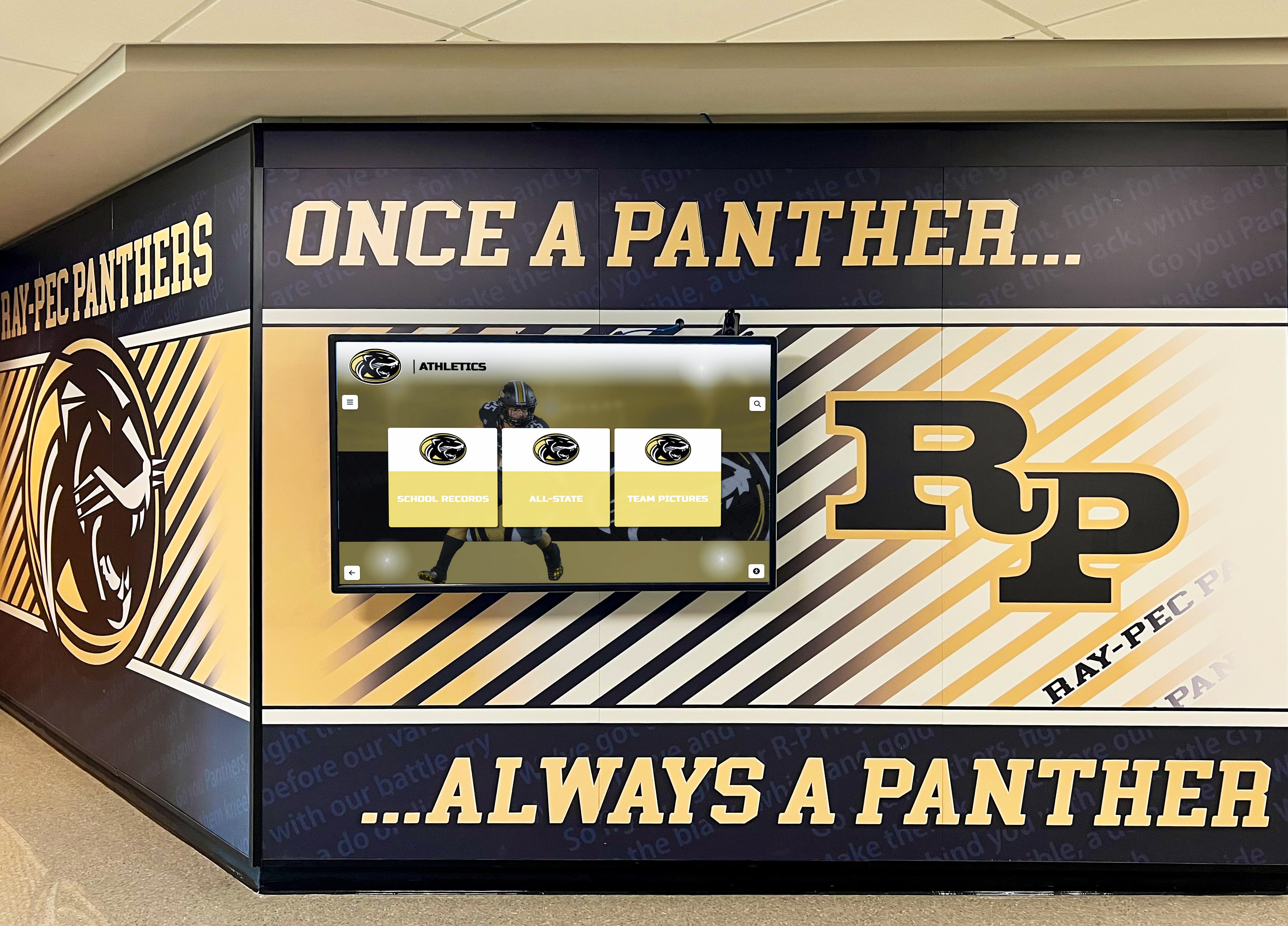
Ambient lighting from the corridor is part of the color test environment — running the acceptance check under installed lighting conditions, not in a darkened room, produces results that reflect real visitor experience
Color Gamut Testing for Multi-Panel Installations
Schools installing recognition display arrays — a series of athletic hallway panels, a donor corridor with multiple screens, or a hall of fame with flanking displays — face an additional color consistency concern beyond single-panel accuracy: inter-panel color matching.
When multiple displays show different sections of the same recognition program — separate panels for decade-era athletic records, or side-by-side screens framing a central trophy case — any visible color difference between panels is immediately apparent to visitors. A visitor standing at the junction of two panels and seeing slightly different shades of the same navy blue will notice the discontinuity even if neither panel would fail a single-panel test.
For multi-display installations, add two steps:
After completing individual panel tests, display the same solid team color reference on all panels simultaneously. Stand at the standard viewing distance and look across the full array. Color differences between panels — shifts in hue, saturation, or lightness — will be immediately visible.
If panels show visible differences, check whether all panels are the same model and production batch. Panels from different production batches can have different native color points even with identical settings. If batch matching is not possible, adjust per-panel OSD settings (white balance, individual RGB gain) to bring panels into visual alignment, and document the per-panel settings precisely.
Hall of fame wall design approaches that span multiple physical panels benefit from treating inter-panel color consistency as a design specification from the start — requesting batch-matched panels from the vendor before installation avoids the time-consuming per-panel calibration step after delivery.
Coordinating the Test with Your School’s Recognition Content Team
Color accuracy testing benefits from involving the people responsible for the school’s recognition content, not just the AV or IT team. Athletic directors, communications staff, and facilities coordinators often have better familiarity with what the school’s official colors should look like — they have seen them on uniforms, printed banners, and trophy plaques for years.
Request a brief observation session with an athletic director or communications coordinator during Step 2 of the test (team color verification). Their visual judgment about whether the displayed navy matches the school’s navy is more reliable than any instrument-free technical assessment, because they have a reference memory built over years of working with those colors.
Schools that include digital hall of fame content policies in their recognition programs understand that color consistency is part of the institutional presentation standard. A display accepted with a visually inaccurate team color produces content that will look wrong for the life of that display — and will require either a display replacement or a workaround color correction in every piece of content the school produces.
Color Testing and Focus Indicator Visibility
For schools that have already reviewed focus indicator visibility requirements for accessible recognition displays, color gamut testing connects directly to accessibility: a display with a compressed color gamut or a significant color shift may not render the high-contrast focus indicators required for keyboard navigation at sufficient contrast ratios. If the acceptance process includes accessibility verification, run the color gamut test first — a display in the correct color mode with an accurate color point will produce more predictable focus indicator contrast than one running in an unchecked Vivid mode.
Pass, Escalate, or Investigate: Decision Framework
Pass — Accept the color performance. All test steps show accurate hue, saturation, and lightness matching the physical reference from visitor viewing distance. The OSD settings are confirmed and documented. Sign acceptance paperwork, photograph the display running the team color reference files, and file the completed color test record alongside the cable continuity records, motion test records, and network documentation in the school’s installation documentation package.
Investigate before accepting. One or more tests show a discrepancy that may have a correctable settings cause. Work through the diagnosis table, apply corrective actions (color mode change, color temperature adjustment, color range setting), and re-run the failing test. Document the corrective action and the re-test result.
Escalate to vendor. A discrepancy persists after all corrective actions. Document specific failing colors with photographs taken under the installed lighting conditions, note the full OSD settings state, and communicate in writing before signing acceptance paperwork. Vendors have more leverage to resolve color accuracy problems before acceptance than after, and a written record of the problem and corrective attempts protects the school in any warranty discussion.
Most professional recognition display installations from established vendors pass a visual color gamut test on the first attempt when the display has been configured to Standard or sRGB color mode at 6500K. The value of this structured procedure is identifying the minority of installations where factory defaults, installer configuration choices, or panel batch variation create color discrepancies that will become permanent visual problems in the school’s recognition program.
Frequently Asked Questions
How long does a recognition display color gamut test take?
Allow 30 to 45 minutes for the full procedure, including pre-test configuration, warm-up, and the five test steps. Preparing the reference color files in advance — before installation day — reduces the on-site time to configuration and observation. Multi-panel installations with inter-panel matching scale proportionally; a three-panel array typically requires 60 to 90 minutes including the inter-panel comparison step.
Do we need a colorimeter or spectrophotometer to run this test?
No. This procedure uses visual comparison against physical references — a uniform garment, a printed banner, a Pantone chip — and does not require measurement instruments. Colorimeters and spectrophotometers produce objective measurement data, which is valuable for a formal calibration process, but the goal of a school recognition display acceptance test is to confirm that colors look correct to the administrators and families who will use the display — a standard that visual comparison can adequately verify.
Our display doesn’t have an sRGB color mode. Which mode should we use?
Use Standard mode, which is typically the factory default and applies the least color processing. Avoid Vivid, Dynamic, and Presentation modes, which enhance saturation beyond the source signal and make specific color matching unreliable. Some displays label their neutral mode as Cinema or Movie — if Standard is not available, choose whichever mode applies the least color modification.
Can we test color accuracy using a TV or computer monitor as the reference?
A consumer TV is generally not a reliable color reference because most consumer televisions are calibrated for high-saturation viewing rather than color accuracy. A laptop or desktop monitor is more useful as a reference if it has been recently factory-reset to sRGB mode and has not been adjusted with custom color settings. A printed Pantone chip or a uniform garment is a more reliable physical reference than any uncalibrated consumer display.
What if the school doesn’t have an official RGB color specification?
Contact the school’s athletic department or communications office first. If no written specification exists, the next most reliable source is the color values embedded in an official vector version of the school logo (SVG or AI format), which a graphic designer or print vendor may have on file. As a last resort, use a color picker tool on a high-quality screenshot or scan of official branded materials, noting that this approach introduces uncertainty and should be treated as a provisional specification until an official value is obtained.
Should we re-run the color test after the school’s CMS is updated?
Yes, particularly after major CMS updates. Some CMS platforms update their color rendering pipeline as part of software updates — changes to how the platform encodes or delivers video, applies ICC profiles, or handles image thumbnails can alter displayed colors even if the display OSD settings are unchanged. A brief spot-check of the primary team color swatch and one archival photograph after a major CMS update confirms that the rendering pipeline has not changed.
How do we store the OSD settings after acceptance?
Photograph every OSD screen that contains a color or picture setting after the test is complete and the display is accepted. Store the photos alongside the written acceptance record — include the display’s serial number, installation date, and the name of the IT coordinator who conducted the test. If the display manufacturer provides a way to export settings to a USB drive or save them to a named profile within the OSD, use that feature and store the export file with the installation documentation.
A recognition display color gamut test adds under an hour to a school installation and permanently reduces the risk of color quality complaints after go-live. Set the display to Standard or sRGB mode at 6500K, disable color enhancement features, allow a 15-minute warm-up, then compare solid team color swatches, archival photographs, and logo graphics against physical references from the standard visitor viewing distance. Document every result — including the corrective action taken for any failing test — before signing acceptance. The color test record belongs alongside the motion test, cable continuity record, and network configuration notes: together they give any future IT coordinator or AV technician a complete picture of how the display was commissioned and how to restore it if settings are ever reset.
Looking for a recognition display partner that configures and verifies color accuracy before go-live? Rocket Alumni Solutions installs and manages interactive recognition platforms — hall of fame displays, athletic record boards, donor walls — with structured acceptance processes that include display configuration documentation and content quality verification. Request a demo to learn how their managed installation approach supports school color accuracy from day one.